PX To REM Converter
Why Use REM Instead of PX?
Though it varies from case to case but most of the time using relative font-size such as REM is preferred by web developers especially working with responsive web design. The main reason for this choice is the fact that it is RELATIVE font-size and defining font-sizes in REM will allow browsers to scale-up the fonts based on their browser-settings.
- Open https://www.utilityforweb.com/px-to-rem/
- All calculations are performed on 16px as base value. Change this value as per your needs.
- Enter numeric value either in PX textbox or REM textbox. The system will automatically calculate relative REM/PX value on the go.
PX vs REM: Choose the Right CSS Unit for Modern Web Design
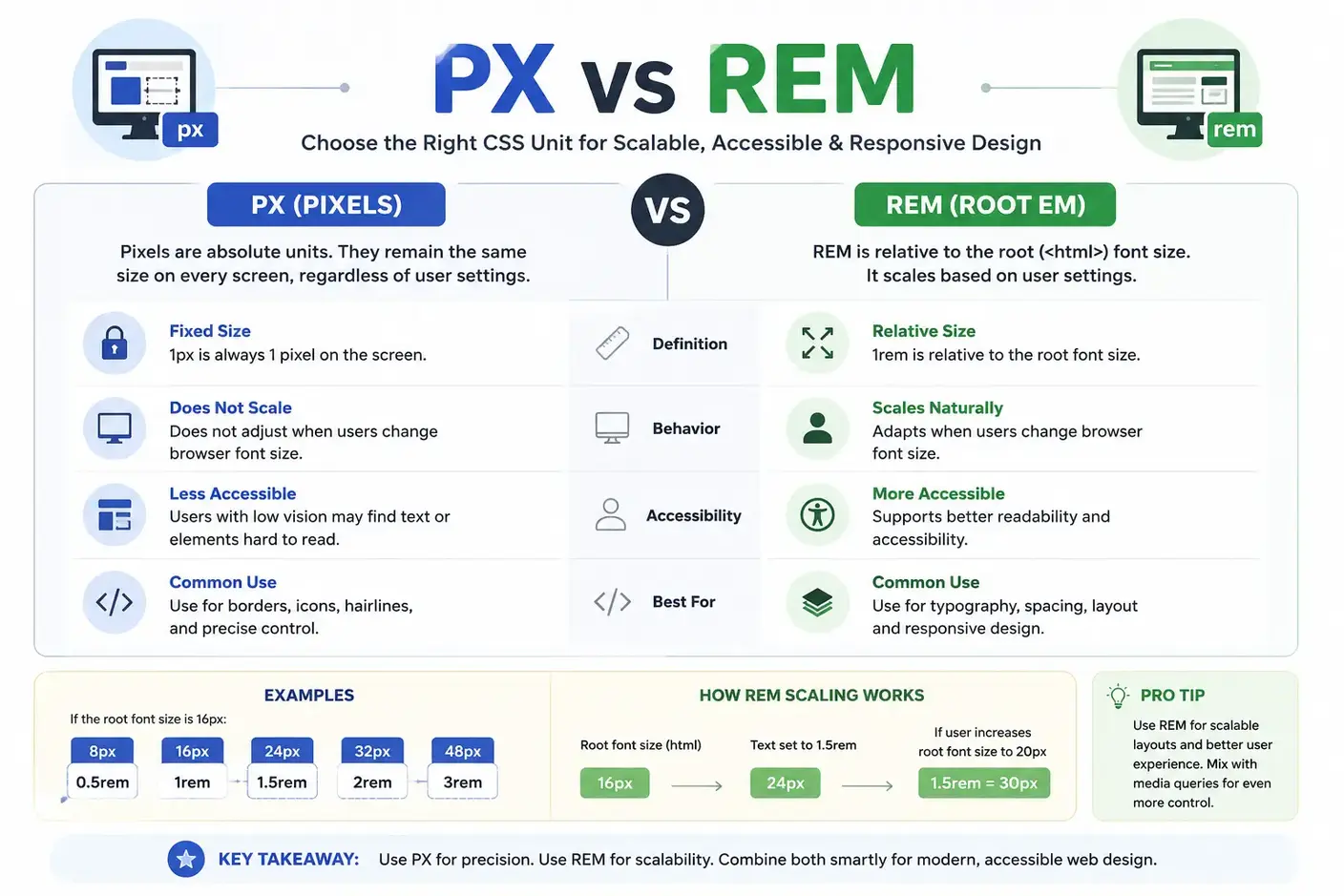
PX to REM Conversion Flow Diagram with Formula and Example
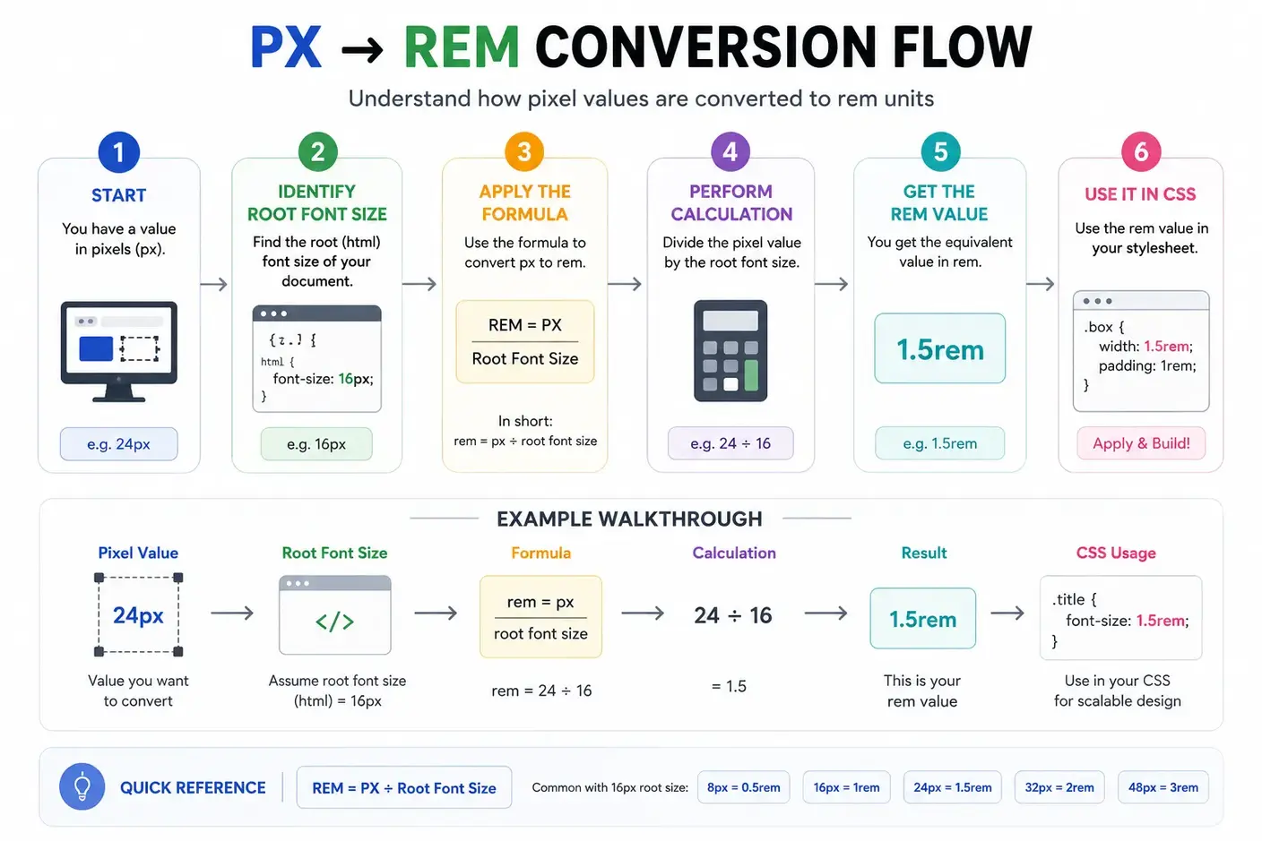
Here are some frequently used conversions based on a 16px root font size:
| Pixels | REM |
|---|---|
| 8px | 0.5rem |
| 10px | 0.625rem |
| 12px | 0.75rem |
| 14px | 0.875rem |
| 16px | 1rem |
| 18px | 1.125rem |
| 20px | 1.25rem |
| 24px | 1.5rem |
| 32px | 2rem |
| 48px | 3rem |
| 64px | 4rem |
Frequently Asked Questions
What is a PX to REM converter tool?
A PX to REM converter is an online tool that converts pixel (px) values into rem units based on the root font size. It helps developers create responsive and accessible CSS by replacing fixed pixel values with scalable rem units. Most projects use a default root font size of 16px, but this value can be customized.
Does this tool support REM to PX conversion?
The tool supports both px to rem and rem to px conversion, making it easy to adjust values based on your design requirements.
How do I convert px to rem online?
To convert px to rem online, input the pixel value, set the root font size (commonly 16px), and get the rem result instantly.
Use this simple formula:
REM = PX ÷ Root Font Size
If the root font size equals 16px, for example:
- 16px = 1rem
- 24px = 1.5rem
- 32px = 2rem
Our converter performs the calculation instantly without manual math.
How do I convert rem back to px?
To convert rem to pixels, use the following formula:
PX = REM × Root Font Size
If the root font size equals 16px, for example:
- 1rem = 16px
- 1.5rem = 24px
- 2rem = 32px
The tool supports both PX to REM and REM to PX conversion.
Can I use this PX to REM converter for free?
Yes, the PX to REM converter is entirely free to use online, with no sign-up or downloads required.
Can I change the base font size in this converter?
Yes. Although 16px is commonly used as the default root font size, this converter allows you to enter a custom base value. The calculations update instantly using the new root font size.
What is the difference between px and rem?
Pixels (px) are fixed units tied to screen pixels, whereas rem units are relative to the document’s root font size, allowing layouts to scale with user preferences.
What is the difference between REM and EM?
REM and EM are both relative CSS units, but they use different reference points. REM always uses the root (<html>) font size, so it produces consistent sizing throughout a website. EM uses the font size of the parent element, which means nested elements can scale differently. Most developers choose REM for typography and spacing because it creates predictable and easier-to-maintain layouts.
Is 1rem always equal to 16px?
No. While 16px is the browser default in most cases, websites can change the root font size using CSS. If the root font size is 18px, then 1rem equals 18px. Always use the actual root font size when converting between px and rem.
What root font size should I use?
Most websites use 16px as the default root font size because it aligns with browser defaults. Some design systems use values like 10px or 18px for easier calculations or specific accessibility requirements.
When should I use PX instead of REM?
Use PX when an element needs a fixed size that should not change with the root font size. Borders, thin lines, icons, shadows, and other pixel-perfect UI elements often work better with PX. For typography, spacing, and layouts, REM usually provides better scalability and accessibility.
Should I use px or rem for font sizes?
For most websites, rem is the recommended choice because it respects user browser settings and improves accessibility. Pixels may still be appropriate for elements that require fixed dimensions, such as borders, icons, or certain graphical components.
Which CSS properties can use REM units?
Most length-based CSS properties support rem values, including:
- font-size
- width
- height
- padding
- gap
- border-radius
- max-width
- min-height
Using rem units helps maintain consistent scaling across different screen sizes and devices.
Can I use decimal REM values?
Yes. CSS fully supports decimal REM values such as 0.625rem, 0.875rem, 1.125rem, and 1.5rem. Decimal values help you match precise pixel measurements while keeping your design responsive. Our PX to REM converter calculates accurate decimal values for any input.
Does changing the browser font size affect REM values?
Yes. REM units scale according to the browser's root font size. When users increase or decrease their default font size, all elements that use REM adjust automatically. This behavior improves readability and accessibility. Pixel values remain fixed and do not respond to browser font size changes.
How do I find the root font size of a website?
Open your browser's Developer Tools and inspect the <html> element. In the Computed or Styles panel, look for the font-size property. That value determines how browsers calculate REM units. If no custom value exists, most browsers use a default root font size of 16px.
Does Tailwind CSS use rem?
Yes. Tailwind CSS uses rem units for typography, spacing, sizing, and many utility classes. This makes Tailwind layouts responsive and consistent across different devices and browser settings.
Does Bootstrap use rem units?
Yes. Modern versions of Bootstrap use rem units for typography, spacing, buttons, and many UI components. This approach improves scalability and accessibility while maintaining consistent proportions.
Is REM supported by all modern browsers?
Yes. All modern browsers, including Chrome, Firefox, Safari, Edge, and Opera, fully support REM units. Browser support has remained consistent for many years, making REM a reliable choice for responsive and accessible web design.
Is rem better for responsive web design?
Yes. REM units are widely recommended for responsive web design because they scale relative to the root font size instead of remaining fixed like pixels. This makes websites easier to maintain and more accessible across devices and user settings.
Can this converter be used for CSS properties beyond font size?
Yes, the PX to REM converter can be used for any CSS properties that accept px or rem units, including spacing, sizing, and layout values.
Why should I use rem instead of px?
REM units scale based on the root font size, making layouts more responsive and accessible. Users who increase their browser's default font size can read content more comfortably when websites use rem units. Pixels remain fixed and do not automatically adapt to user preferences.